A Teacher-Friendly Exam Editor
Learning from teachers to create a no-brainer experience.
Schoology | Web Design | 2016
Updating Schoology's Most Used Feature. NBD.
The Text/Quiz editor - one of Schoology’s oldest and beloved features used by teachers to create online exams - needed to incorporate 12 new question types. The quantity of questions introduced scaling and space concerns that created opportunities for improvements to the user experience.
Listening to Our Teachers
Working with a legacy feature, we interviewed teachers to better understand their goals and pain points. They loved how robust and flexible the exam editor was, but felt the experience could be more efficient. The process of adding questions was long and cumbersome. Teachers also dealt with excessive scrolling, which became a problem when there was a lot of content to work with. Reviewing all the feedback, my team and I decided to give the entire Test/Quiz editor a complete makeover.
We wanted to define a new layout that exposed question types, improved quiz creation and reduced unnecessary scrolling.
Taking Advantage of Space
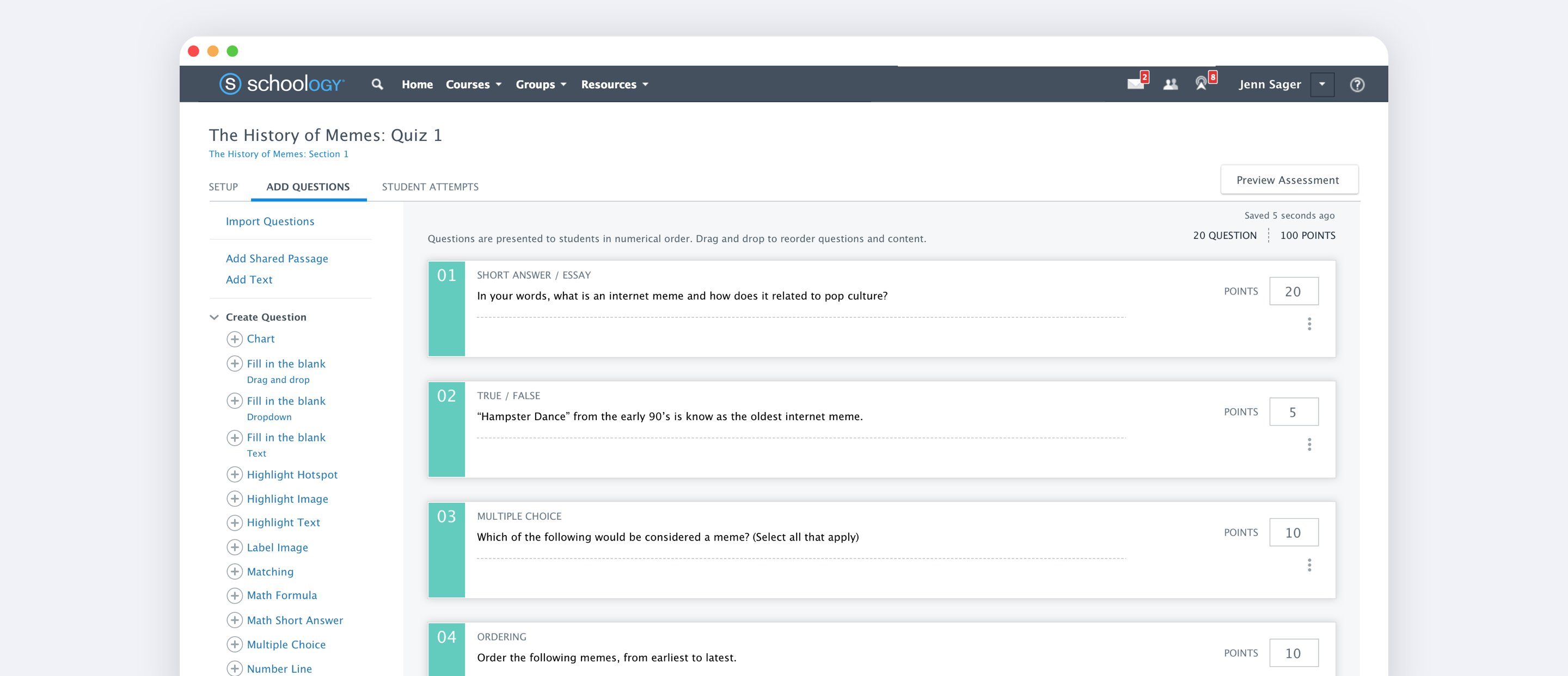
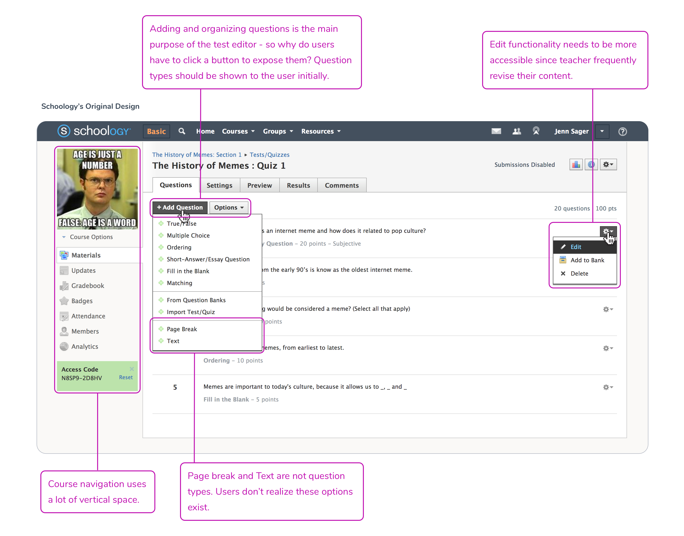
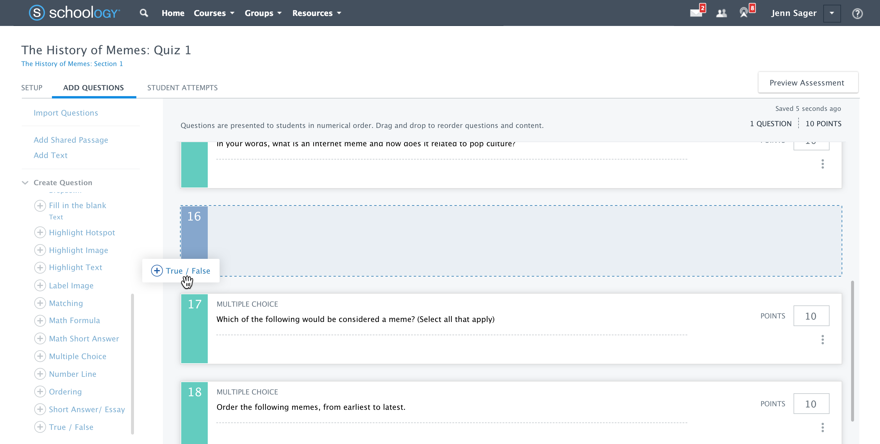
To give the editor more real estate, we removed the left-hand course menu and extended the screen width from 1200px to 1440px. With the extra space, we removed the confusing “+ Add Question” drop down button and exposed the list items in a left-hand menu which reduced the amount of clicks for the user. We also better exposed the question editing functionality which was previously hidden behind an icon.
Lists Working Together
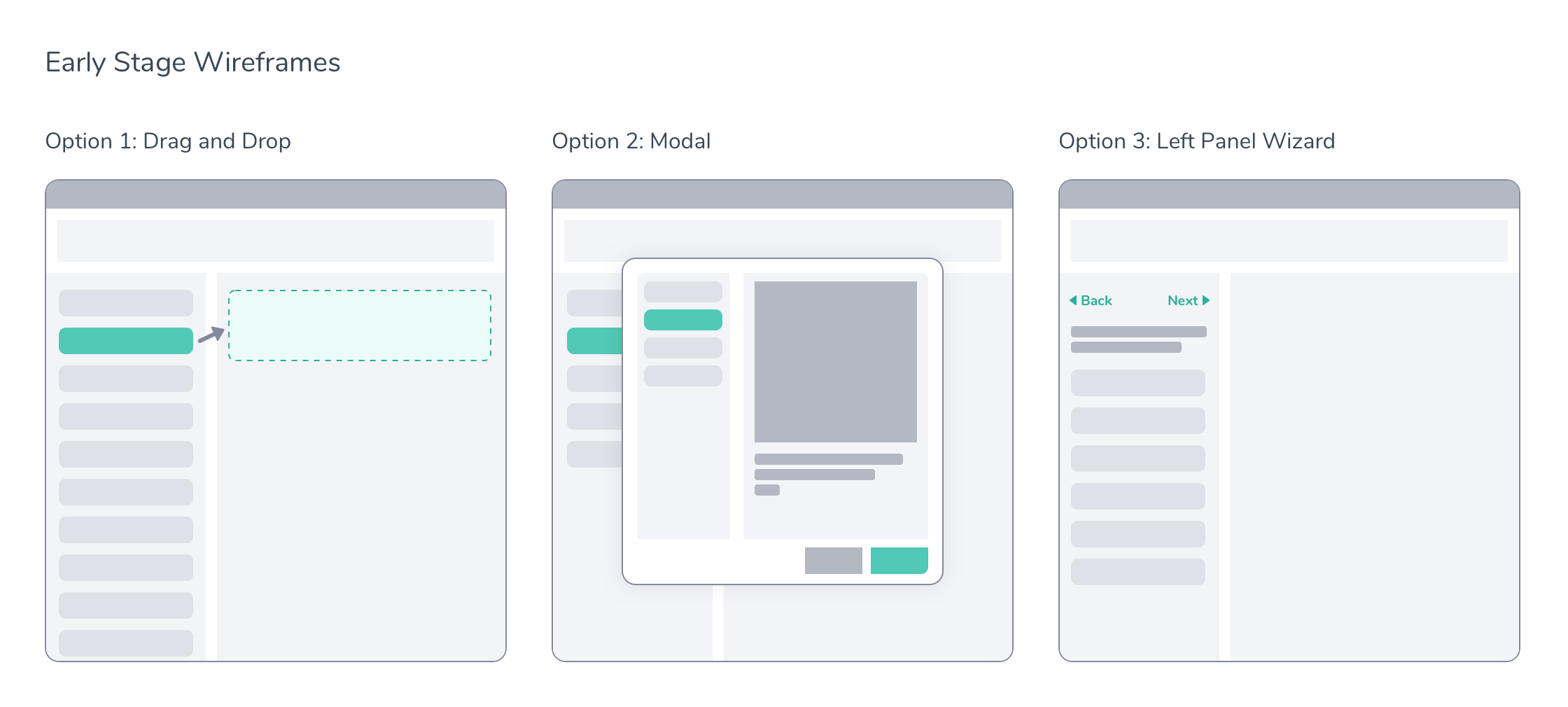
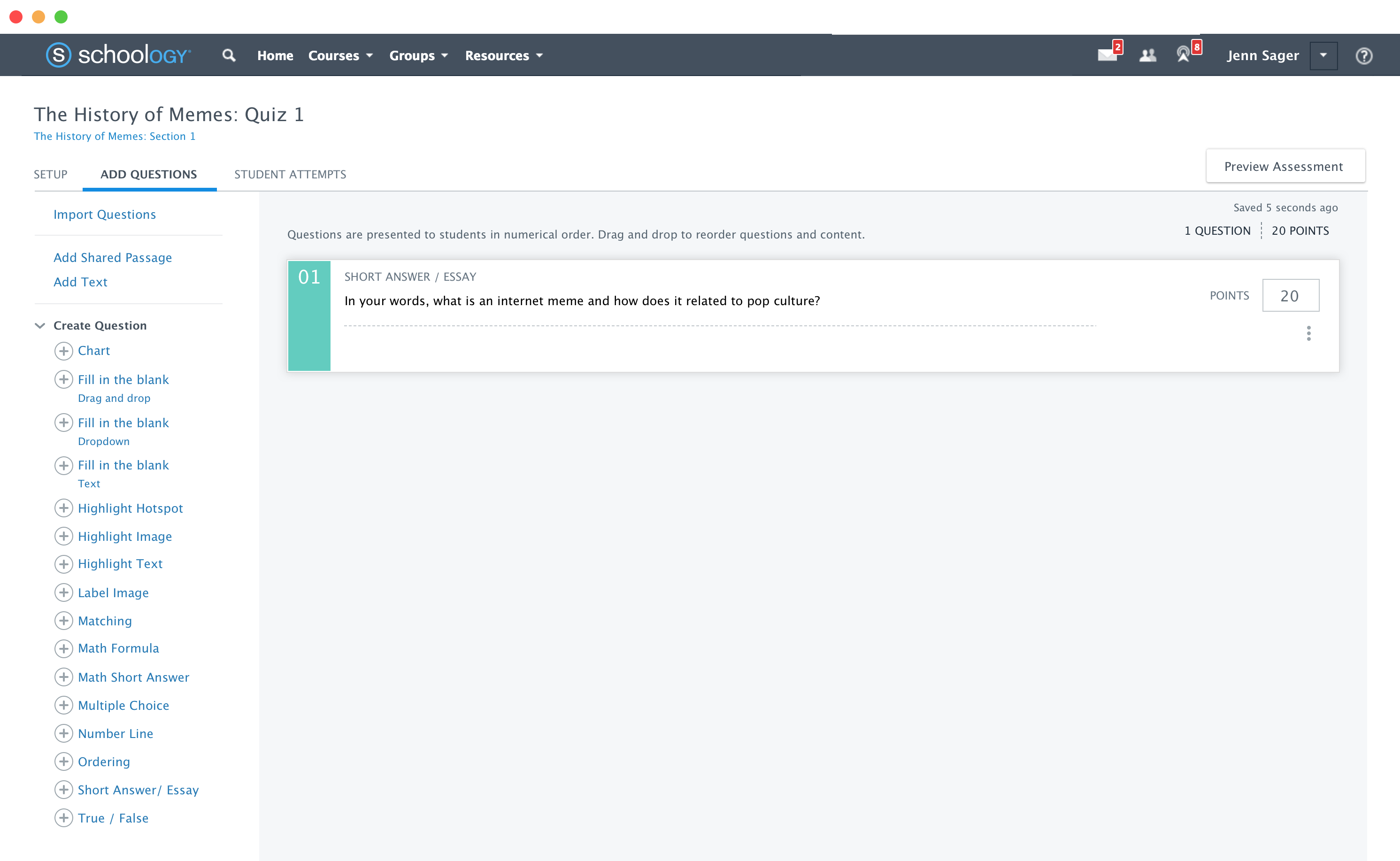
We designed the left and right panels with independent scroll bars and added drag and drop functionality. The user could now add and reorder question types by simply dragging and dropping.
Full Screen Editor
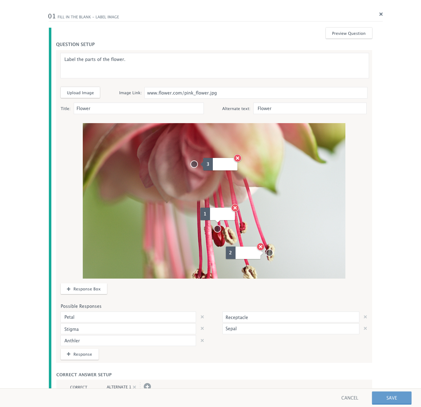
Lastly, we moved the question editor to its own full-screen modal. This not only increased the amount of vertical and horizontal space, but also removed other page distractions which helped the user focus on creating their task at hand.
The Results
Updating Outdated UX is Always a Good Thing
Teachers not only received new question types (which they've been asking for close to a year) but they also got a brand new exam editor interface. In initial user testing, we found teachers really enjoyed the updated layout. They were excited to see a dedicated editor that took advantage of the whole computer screen, especially when they worked on smaller laptops like Chromebooks. Although a bit of a learning curve, they really enjoyed the left and right panels and drag and drop feature which allowed them to think less about clicking on the screen and more about the content of their questions.