Optimizing Cabin Booking For Responsive Design
Improving conversion rates through scalable user experience and interface.
Getaway | Responsive Design | 2018
Growing Pains. We've All Been There.
Getaway, a hospitality company that lets city dwellers book tiny cabins in the woods, noticed low conversion rates among their mobile users. Hotjar videos (a user insights app) and analytics showed the responsive design of their site was not translating well on small screens and resulted in high drop-off rates.
Getaway wanted to increase mobile conversions from 0.45% to ~1% by the end of 2018. Together we decided to tackle this problem in two ways: Design a new user flow for a frictionless, easy to use mobile-first experience and make small improvements to quickly alleviate as many pain points as possible.
The conversion rate nearly doubled by the end of the year.
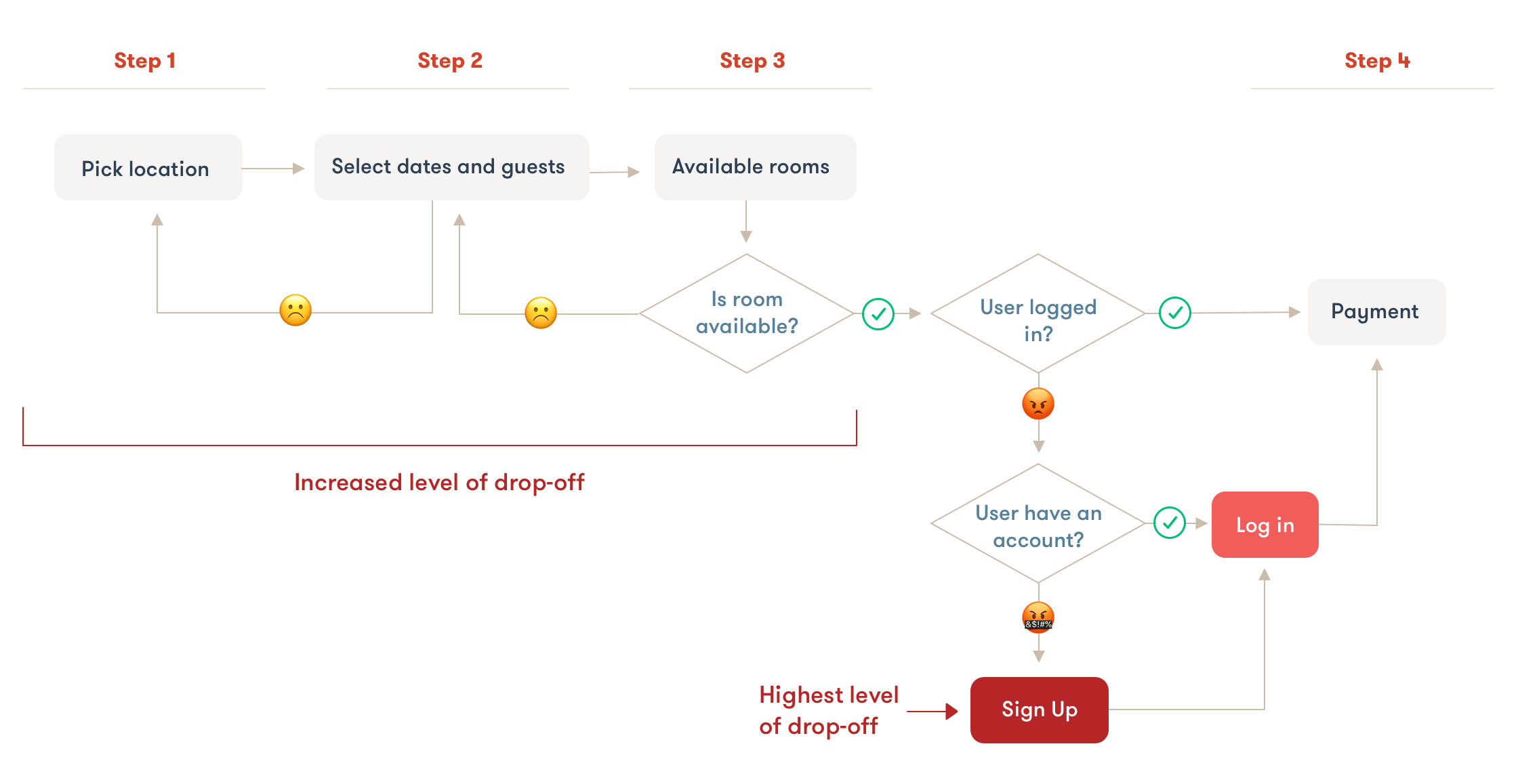
Understanding Why Users Were Dropping Off
Getaway used a 4-step linear process for booking cabins. From the Hotjar videos, we saw users constantly moving back and forth within the flow and eventually abandoning their cart. We concluded users would get to the last step only to find the room they wanted was unavailable due to Getaway’s limited vacancy and popularity. Users would then go back into the booking flow, edit their reservation criteria to see if that yielded any available rooms, but most of the time it didn't.
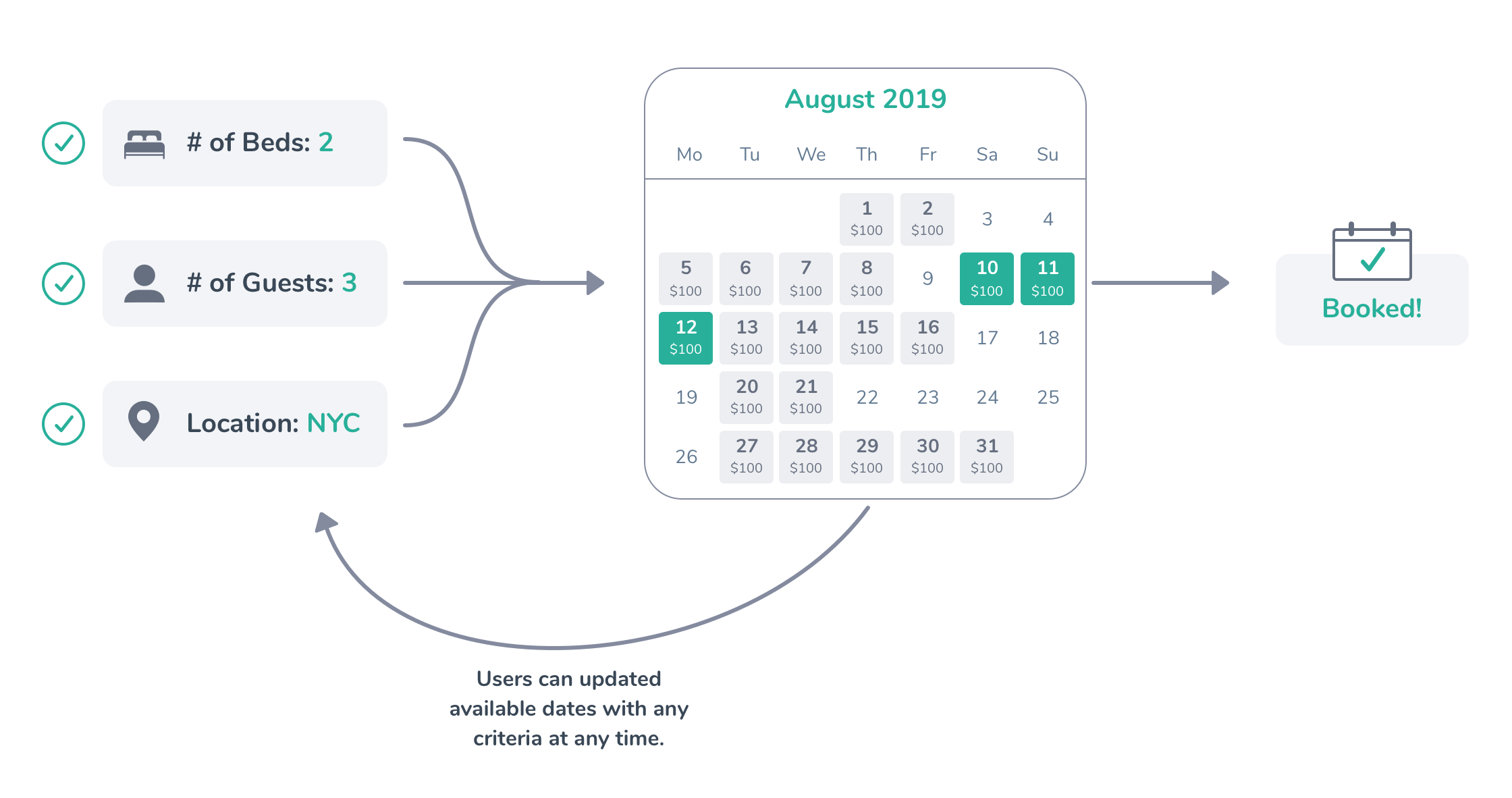
A Flexible Mobile-First Booking Flow
We got rid of Getaway's wizard-like booking flow and implemented a flexible reservation search. Each search criteria used UI patterns like drop downs and modals that allowed users to move back and forth through the booking flow more seamlessly than before.
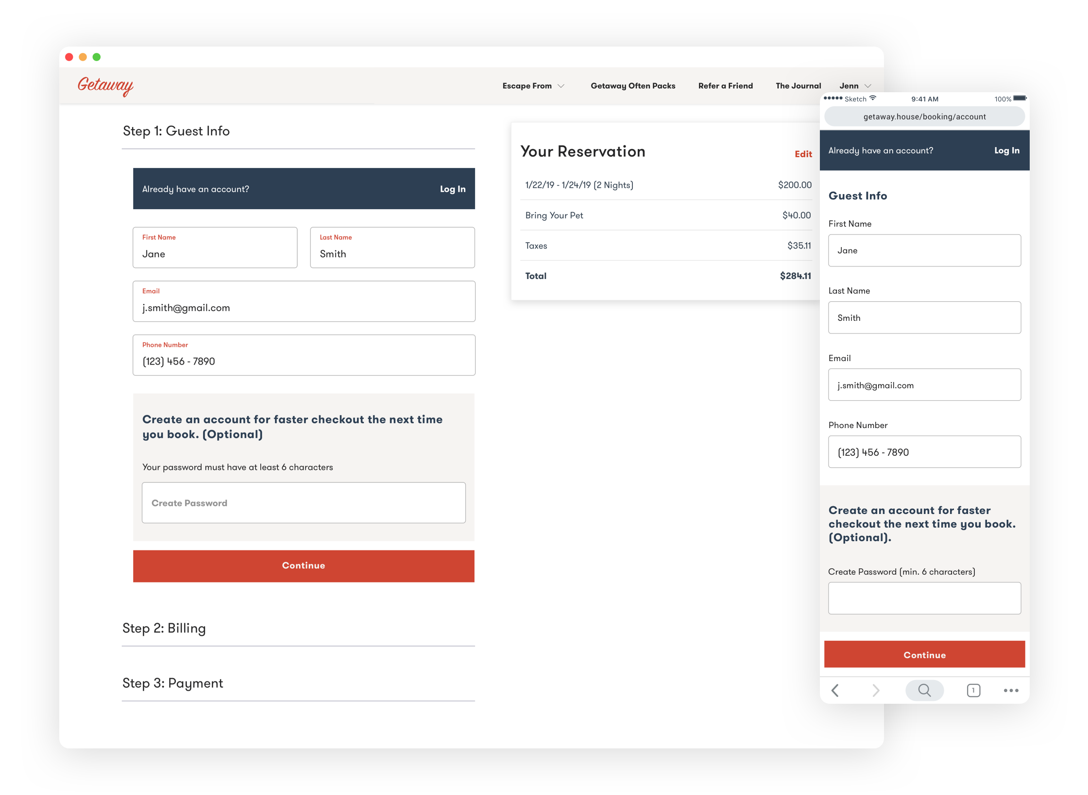
Reducing Abandoned Carts with Guest Checkout
The biggest drop-off point within the booking flow came from a mandatory log in page. Users had to log in before continuing or, worse yet, create an account before securing their reservation.
We hypothesized that removing the sign-in block and allowing for a guest checkout would be a great way to remove friction and increase conversion. The new process gave users the opportunity to checkout without losing their reservation.
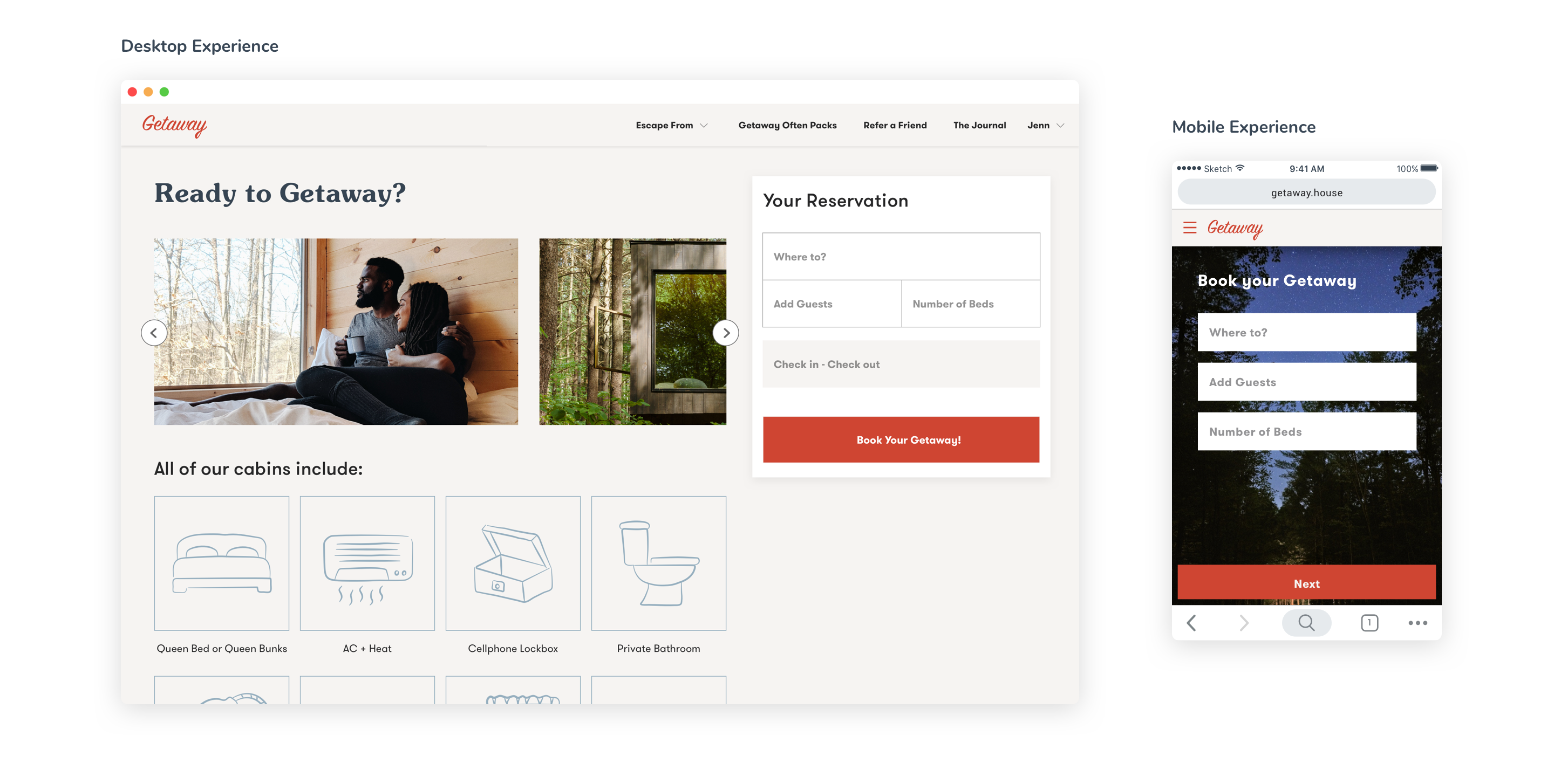
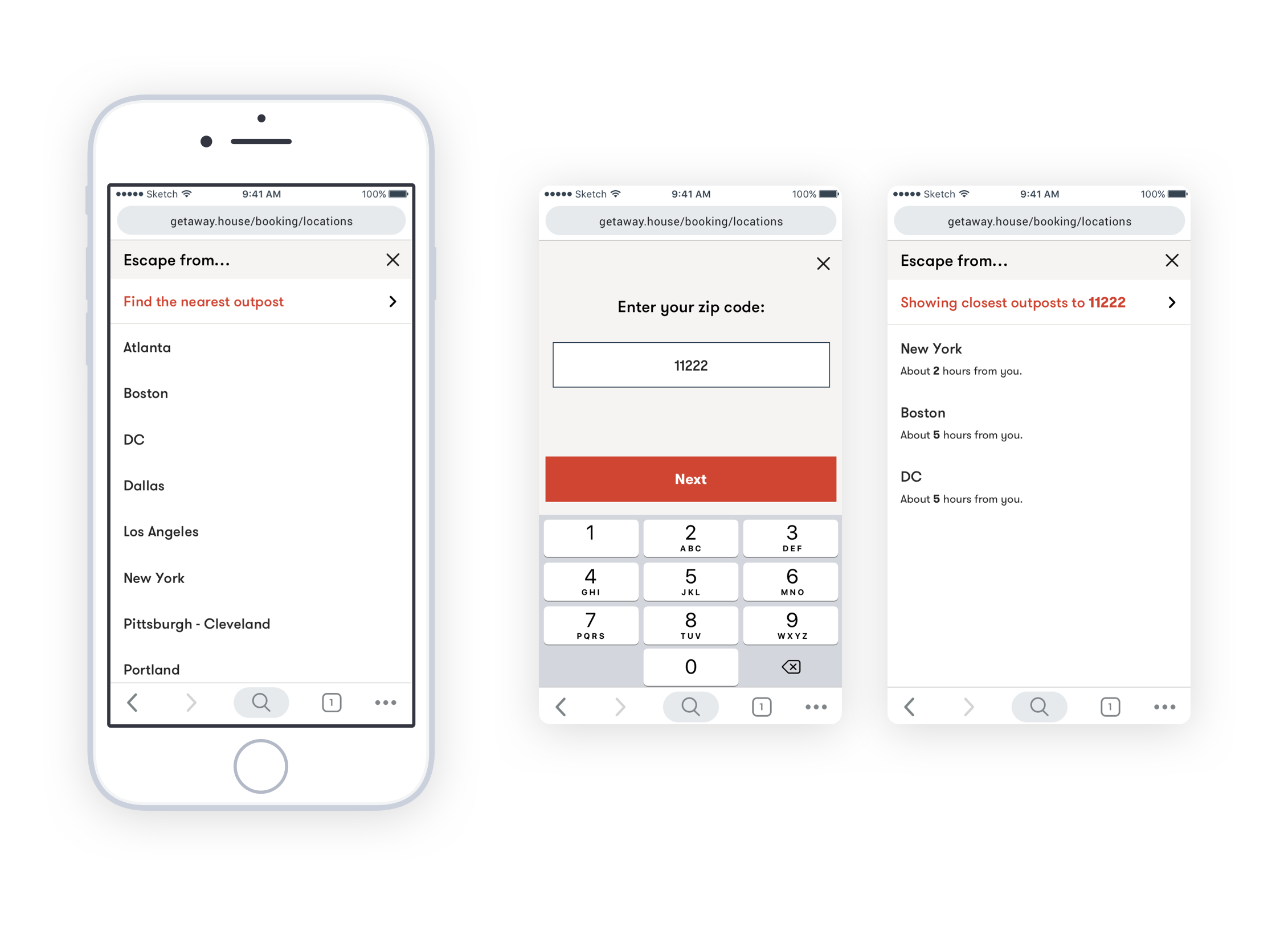
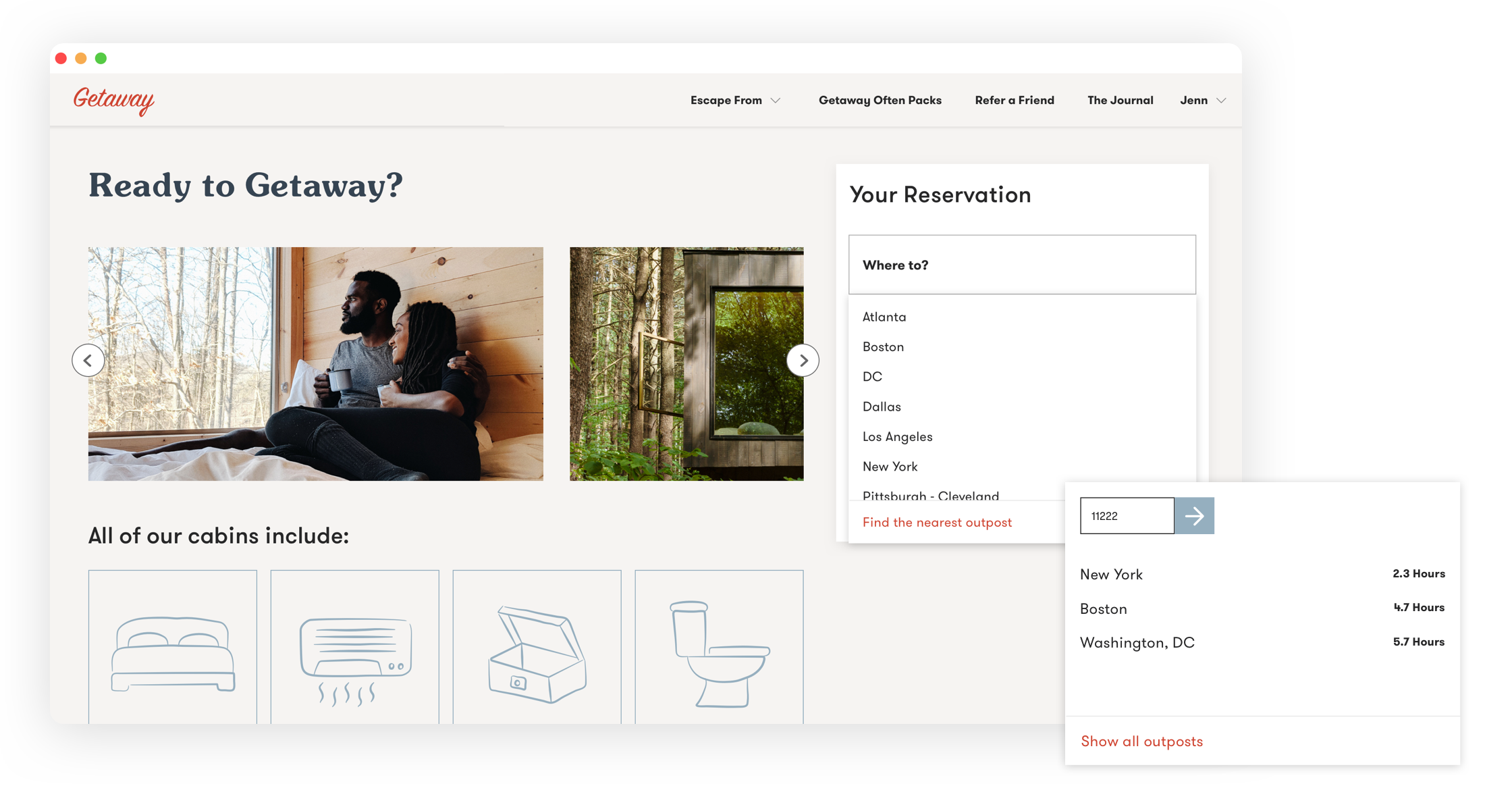
Location
We listed all of Getaway's locations (which was rapidly growing) into a drop down on the reservation page - ensuring they could be updated at any point during the booking experience. Locations were now listed alphabetically and could be sorted based on distance from the user’s zip code.
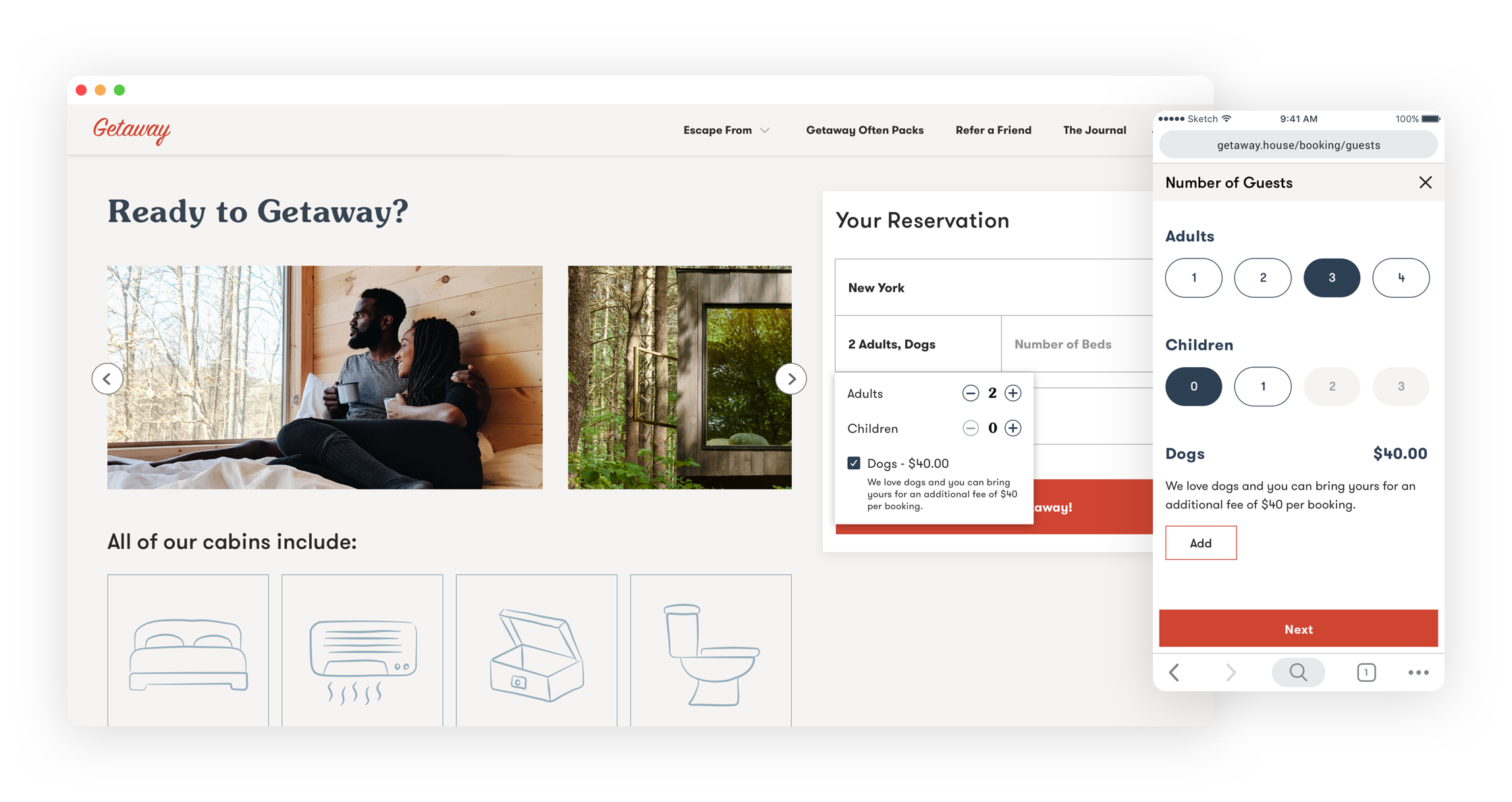
Number of Guests
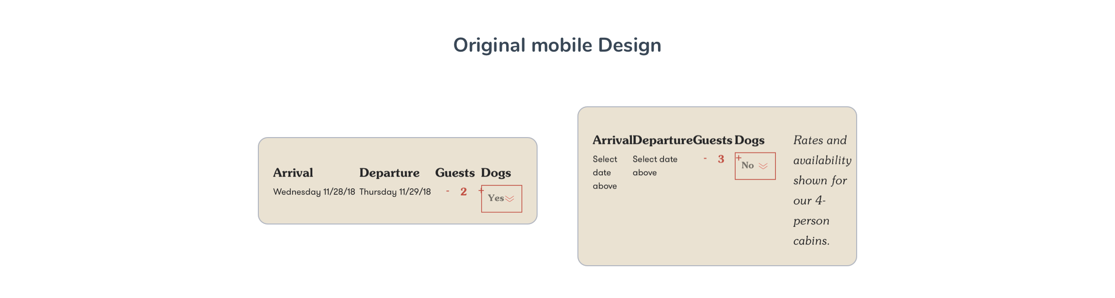
Originally the guest selector and date picker were placed on the same screen. This posed a problem since the date picker consumed most of the real estate and the guest selector was often overlooked. Furthermore, the guest selector was set to 1 guest by default, so users could continue through the flow only to realize they were looking at availability for the wrong guest count. To make matters worse, the mobile experience neglected small device sizes and some fields ran into one another making it extremely hard to tap properly.
To remedy this problem, we moved the guest selector to its own area in the reservation search. On both web and mobile, the selector had plenty of space for proper tap and click zones. We also didn’t add a default number in the field, so users had to select a guest number before viewing the calendar.
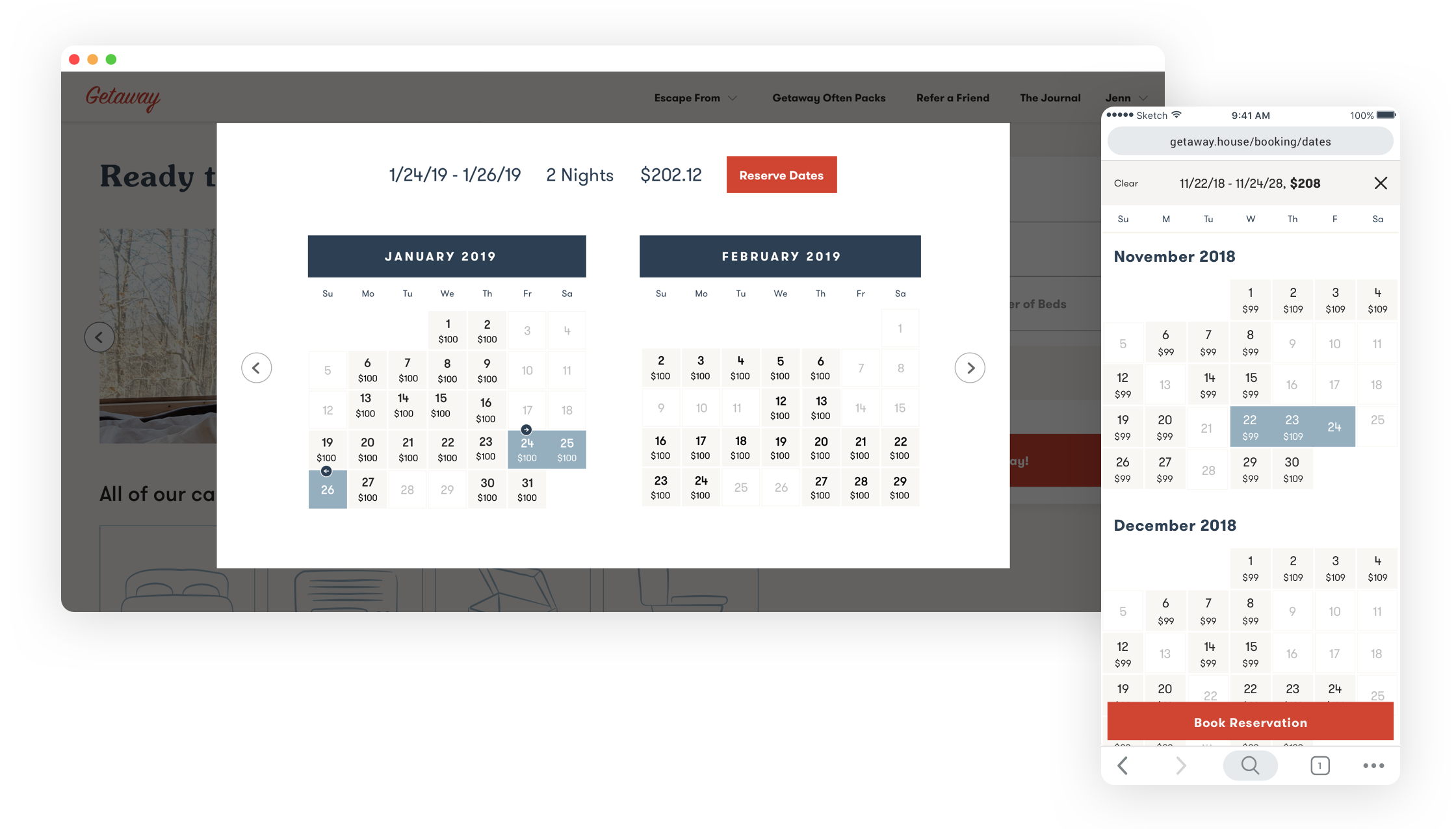
Date Picker
Viewing the date picker on a mobile device posed a number of problems due to the small screen size: Dates shrunk to a very small size making it almost impossible to tap the correct check-in and check-out dates on the first try; text often ran into other text; and the UI only showed one month at a time making users tap a very small arrow every time they wanted to see a new month.
To remedy these issues, we tailored the experience based on screen size, taking full advantage of the real estate each device provided. For mobile, the calendar was comprised of months stacked on top of one another letting users quickly scroll through availability. Because we were optimizing for the space, the size of the date buttons naturally got bigger and easier to tap. For the web, we showed 2 months at a time while keeping the date picker above the fold (which was very important for the marketing team). Lastly, the check-in and check-out dates were pinned on the top of the screen so users could compare what they’ve already selected with future availability.
The Results
Sometimes It Pays off to Be Simple.
After its launch in early 2019, Getaway was thrilled to see their mobile conversion rate nearly double. The simpler booking flow coupled with new outpost locations helped the company not only reach their mobile conversion goals, but also saw an influx in user visits and general interest in the platform.