myOptions iOS Design System
Too many styles, not enough consistency? Fugheddaboudit!
myOptions | iOS native app | 2019
Mo' Features, Mo' Problems
Throughout its existence, several development teams contributed to the myOptions iOS app without a proper visual guide, resulting in many visual inconsistencies. These ranged from basic elements like color palette, spacing, and typefaces, to bigger components like drop downs, navigation, and selectors. The myOptions team decided they needed to tackle this problem head-on by creating a design system that would enforce consistency throughout myOption's online presense. This was especially important since the team was scattered across many locations around the world (Brazil, Kansas City, Austin, and New York).
Unifying Engineering, Product, and Design to build a design system that works
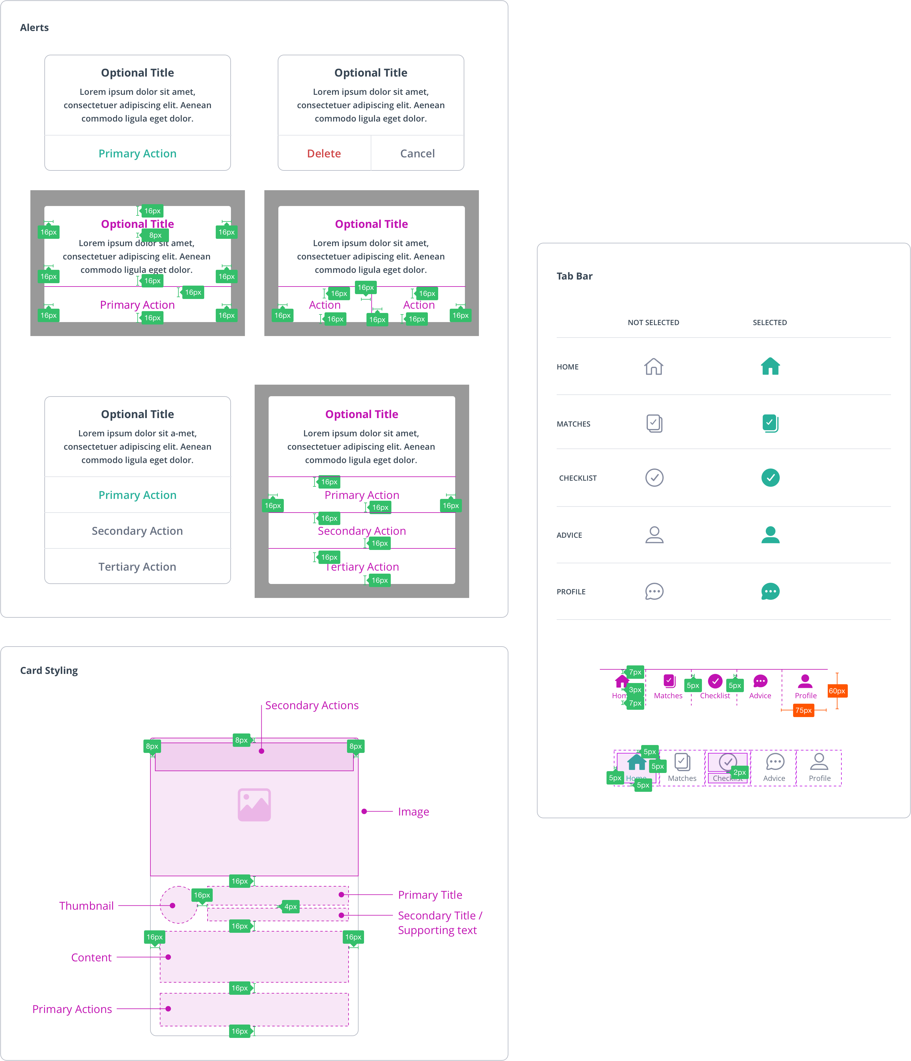
The iOS developer, engineering manager, product owner and myself met 1-2 times a week to discuss the iOS style guide. We first identified how we wanted to break down components across design and development. Using Brad Frost’s Atomic Design as a template we decided to separate our components into foundations, components, modules, and pages.
Working on the visual components, we’d discuss our concerns (from both a visual and development) perspective, often relying on the product owner to decide if the development time was worth the complexities of the component. Together we created common patterns that would be used throughout the app.
From Design and Development to Documentation

We decided to design components using both Apple's Human Interface components and Google's Material Design for iOS. I designed the visuals and behavior of each customized component in Sketch and imported it into Zeplin for our mobile developer to use. We would then document the component using Confluence for future references.
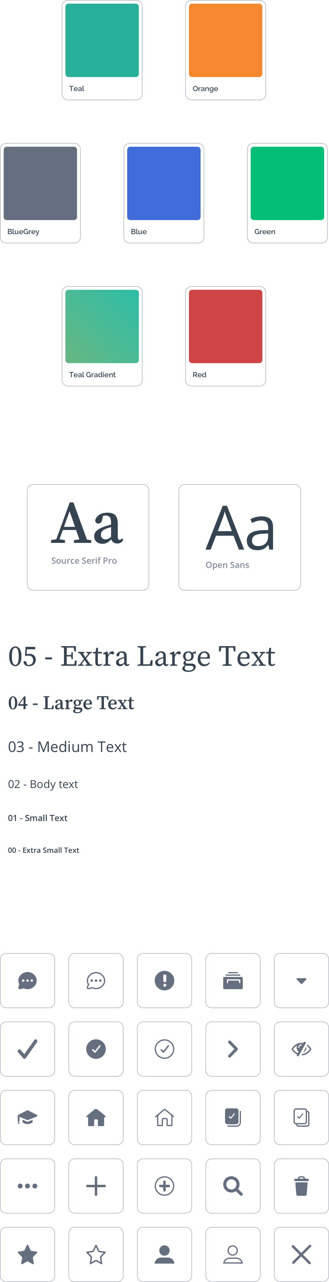
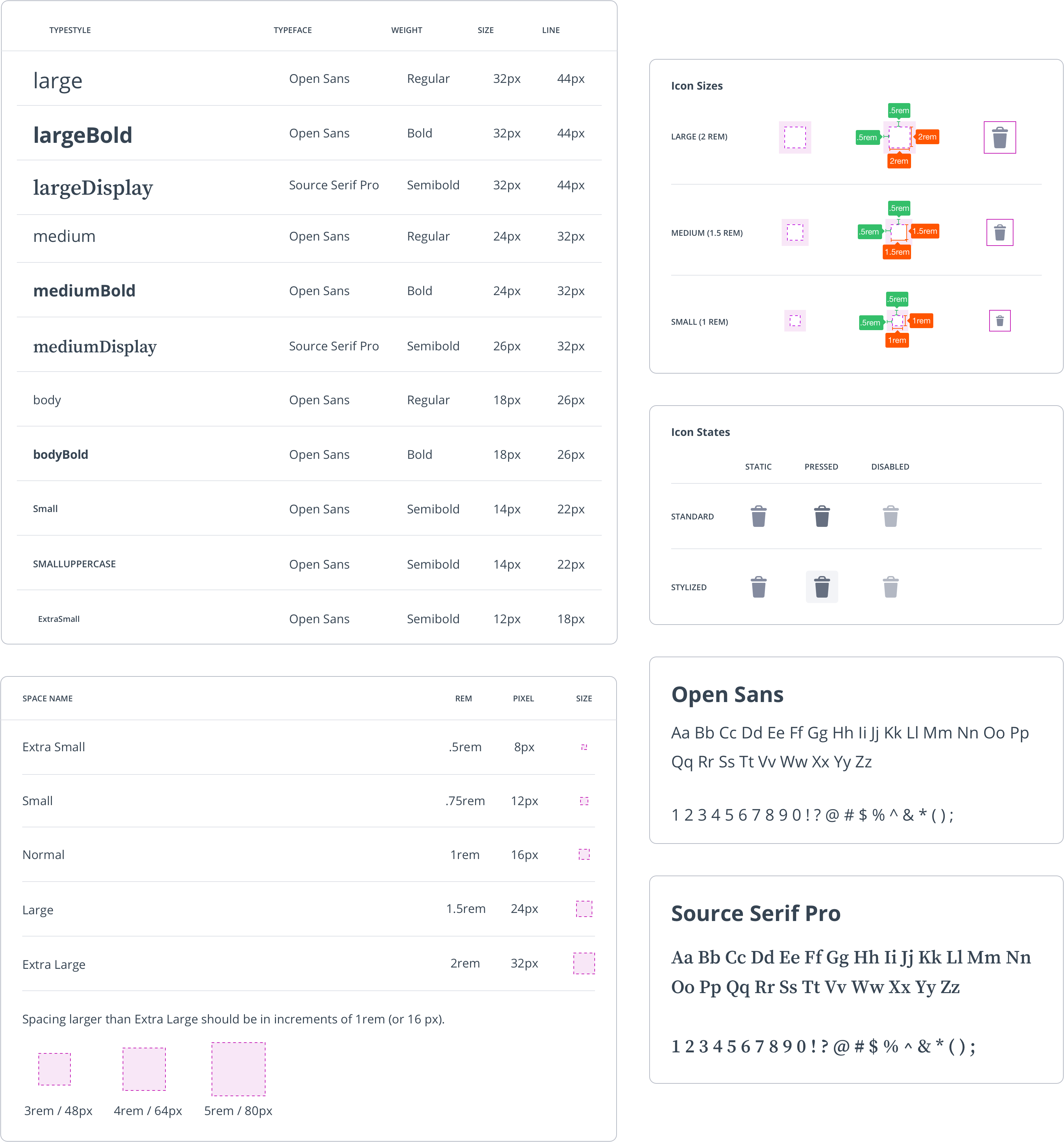
Foundations
Foundation elements were the basic building blocks of our style guide; typefaces, colors, spacing, and icons. In consideration of the myOptions brand, we used colors and typefaces that were friendly, and bold while maintaining a professional and educational feel.
Components
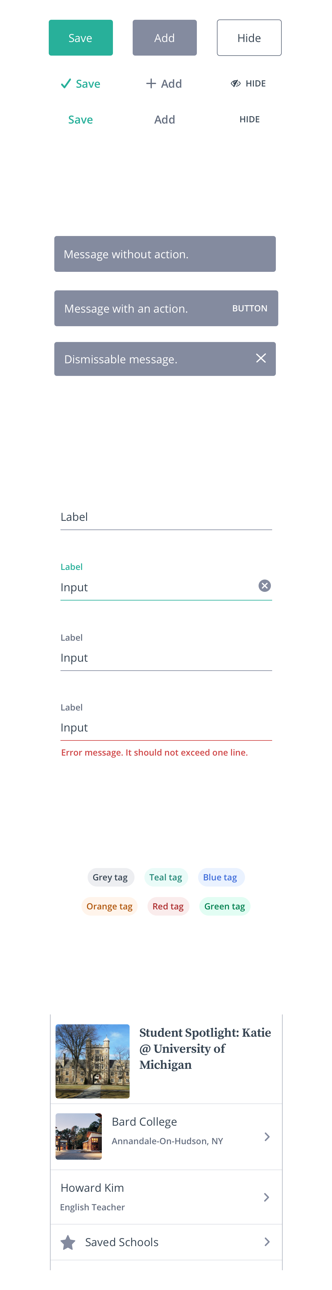
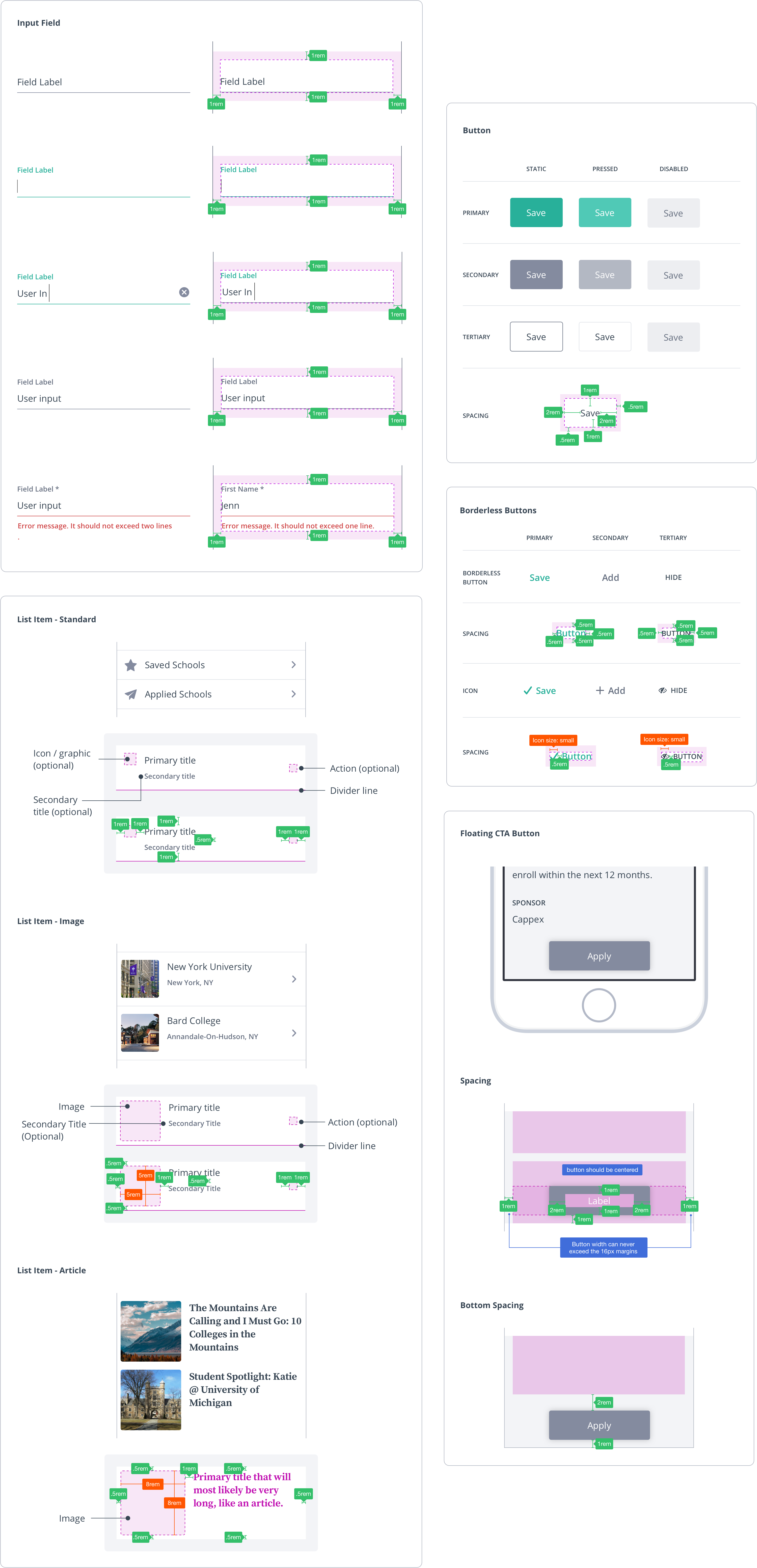
Components are elements that combine the foundational building blocks into slightly more complex items such as buttons, input fields, tags and list items.
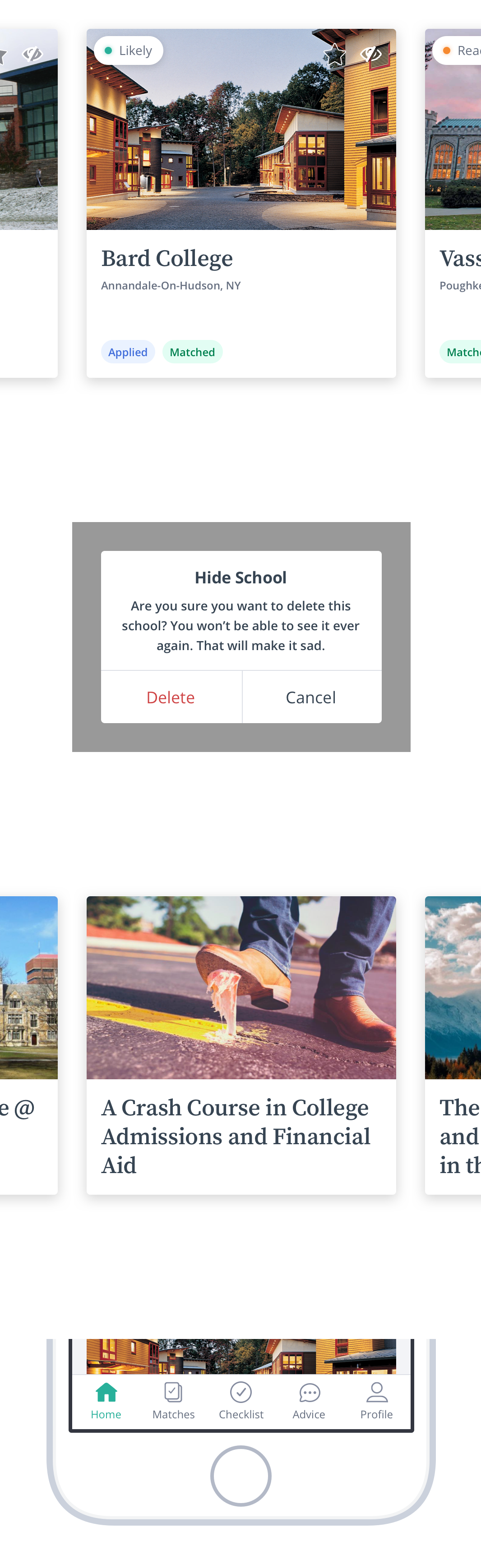
Modules
Modules are groups of elements that work together to form complex actions. These include cards, tab navigation and alerts.
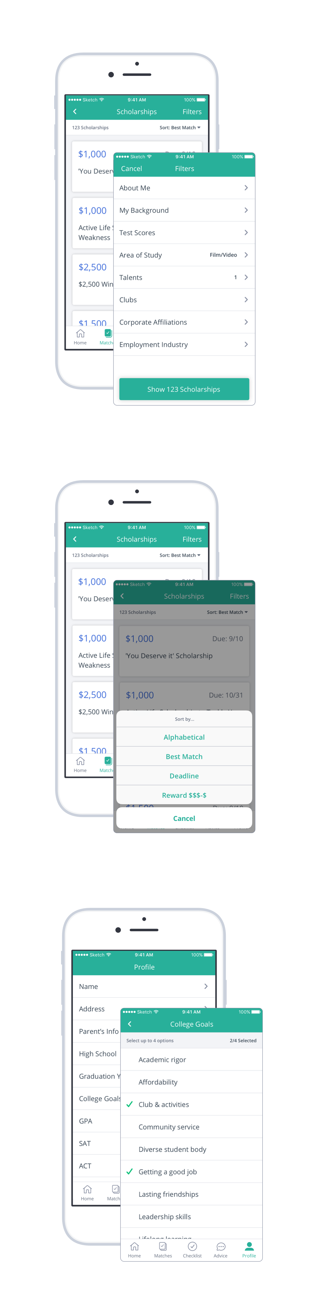
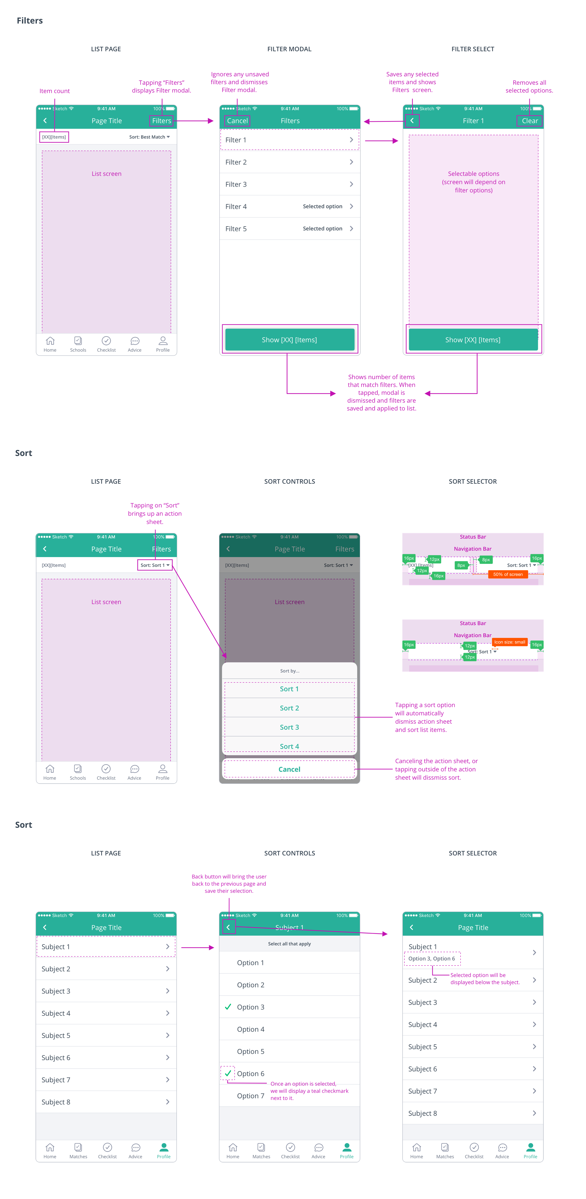
Pages
Pages are made up of groups of modules and components to create full-screen experiences. These include searches, selectors, filters and sorts.
The Results
Better Guidelines = Higher Quality Work
After myOptions handed over the iOS style guide to the scrum team it immediately improved component styling and behavior consistency. New features were designed and developed with a greater level of confidence which resulted in less UI/UX clarification. In fact, the style guide was so successful we saw a decrease in UX/UI bugs logged in JIRA! The team could now spend less time discussing UI patterns and more time tackling fundamental problems like user flows and strategy.
We found the iOS style guide was so valuable to the business and product teams, we decided to continue our efforts and create one for the web and responsive experiences.